When operational dashboards slow down decision-making, productivity suffers.
Coofis NDE is an internal web platform used to manage operational workflows. As usage increased during remote work, the interface became harder to navigate, slower to interpret, and visually inconsistent.
This redesign focused on improving clarity, speed, and system consistency without disrupting existing workflows.
The problem
As the platform evolved, features were added without structural alignment. Navigation became cluttered, visual hierarchy weakened, and critical data competed for attention.
Users reported difficulty locating frequently used tools, while inconsistent component behavior created friction in daily workflows.
This wasn't just a visual issue.
It affected operational efficiency.
Research
User interviews and workflow observation revealed three critical friction points:
- High cognitive load caused by dense data presentation.
- Inconsistent UI patterns across modules.
- Unclear information hierarchy in dashboards.
These issues increased time spent interpreting data and navigating between sections.
Insight:
Clarity in enterprise tools is not about aesthetics — it is about reducing decision latency.
Design strategy
Instead of redesigning the platform entirely, the approach focused on structural refinement rather than disruptive change.
Key strategic decisions included:
- Maintaining familiar layout patterns to avoid retraining costs
- Introducing consistent spacing and component logic
- Simplifying visual noise without removing essential data
The goal was optimization, not reinvention.
Before → after (structural improvements)
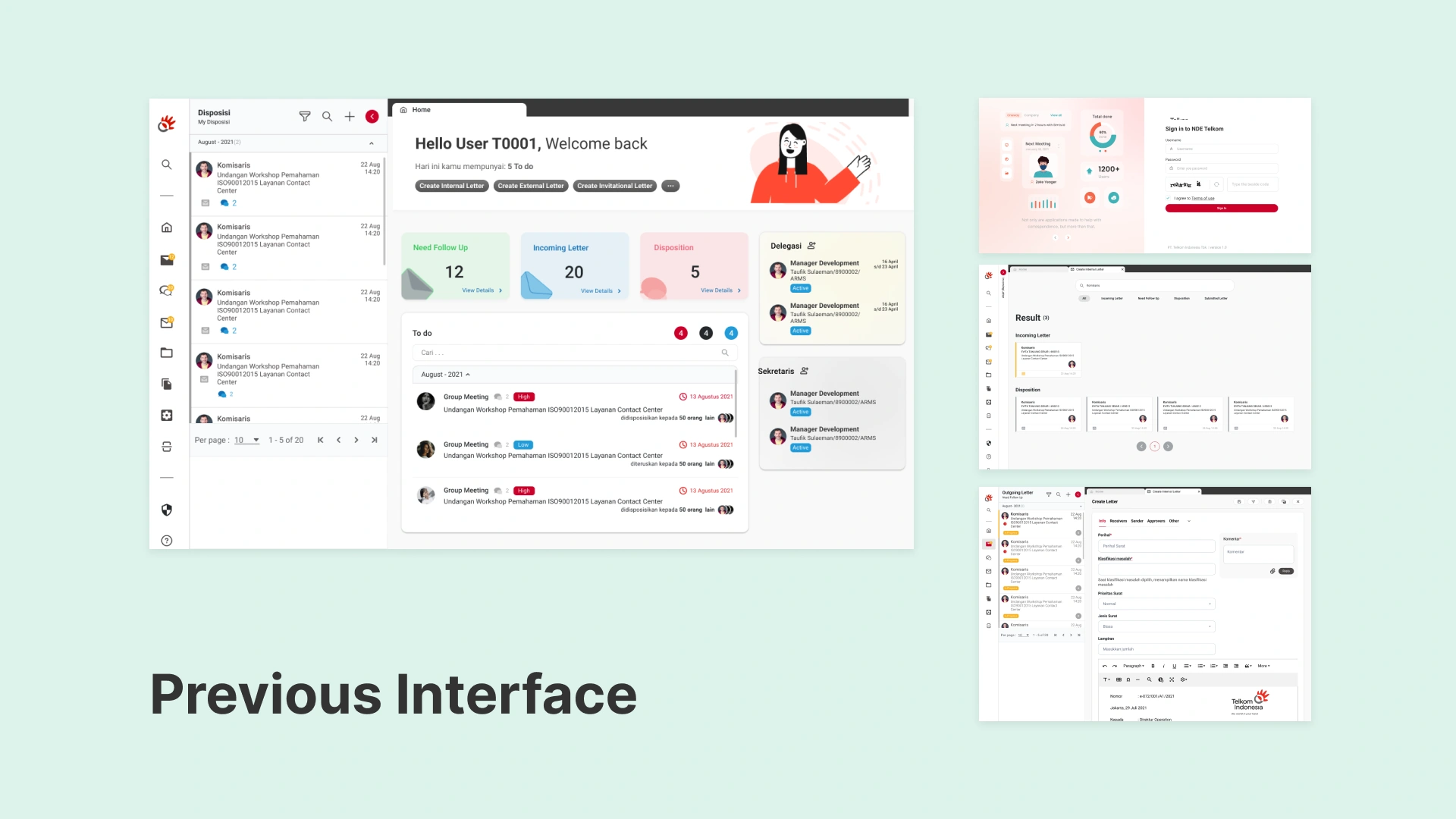
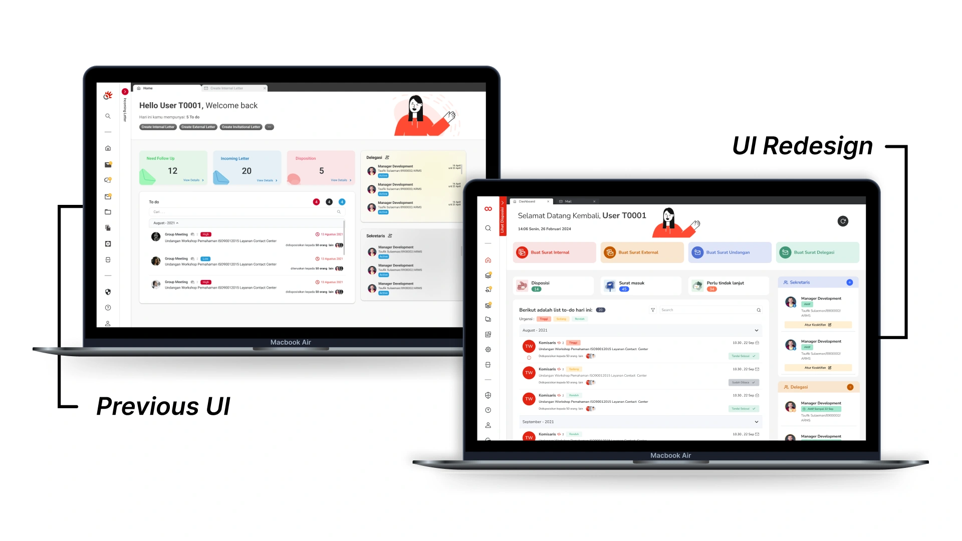
The previous interface relied heavily on dense tables and inconsistent spacing. Key metrics were visually buried among secondary information.
The redesigned interface introduced:
- Clear section grouping
- Standardized component states
- Improved typography hierarchy
- Refined color usage for functional signaling
By restructuring visual hierarchy, information became scannable within seconds rather than minutes.
Systemizing the interface
As multiple modules shared similar functional patterns, a scalable component system was developed.
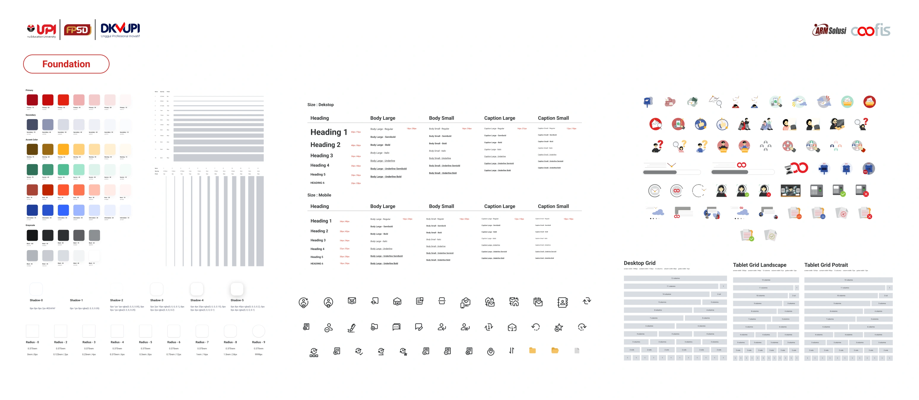
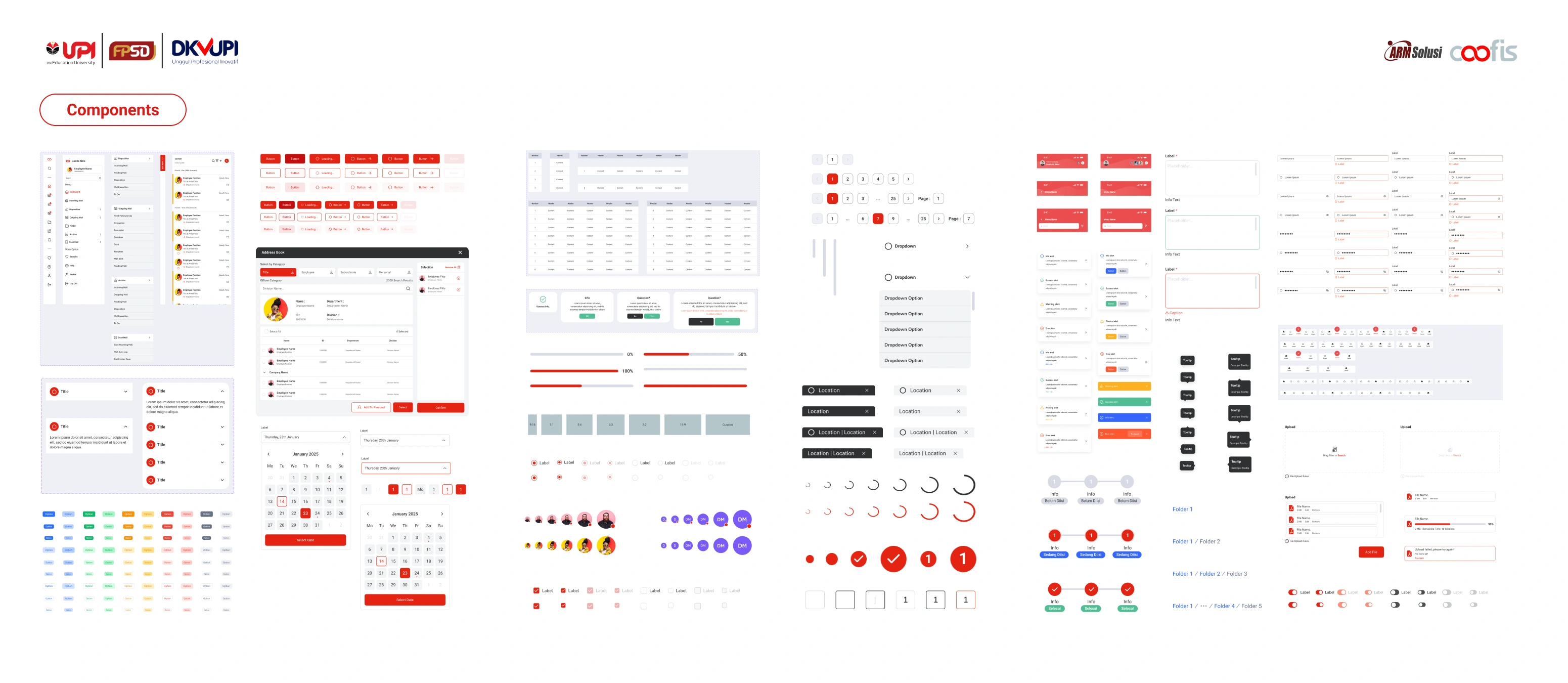
The design system standardized:
- Data tables
- Status indicators
- Form structures
- Navigation behavior
This reduced UI inconsistency across the platform and simplified collaboration with developers.
In enterprise environments, consistency directly impacts efficiency.
Results & impact
After implementation, users reported improved clarity and faster task completion during daily operations.
Navigation errors decreased, and new team members required less onboarding time to understand the interface structure.
The redesign demonstrated that structural clarity can significantly enhance operational confidence.
What I Learn
This project reinforced that enterprise redesign is not about visual refresh. It is about balancing usability improvements with operational continuity.
Working within constraints strengthened my ability to prioritize structural changes over aesthetic experimentation.
Every great project is built together
This project came to life thanks to the amazing collaboration between our team members:
UI/UX Design: Hendy Oktavian, Javier Ramadhan, Ramdhan Mahfudz, Agung Tauhid, Yusran Habibi, Rustu Nur Ilham
Illustration & Visual Assets: Tyara Nissa A, Najla Noor Faizah
Mentor: Muhammad Faizal