As products evolve, interfaces drift. Without a system, inconsistency becomes inevitable.
The Coofis Design System was created to unify fragmented UI patterns across the platform and establish a scalable foundation for future growth.
The problem
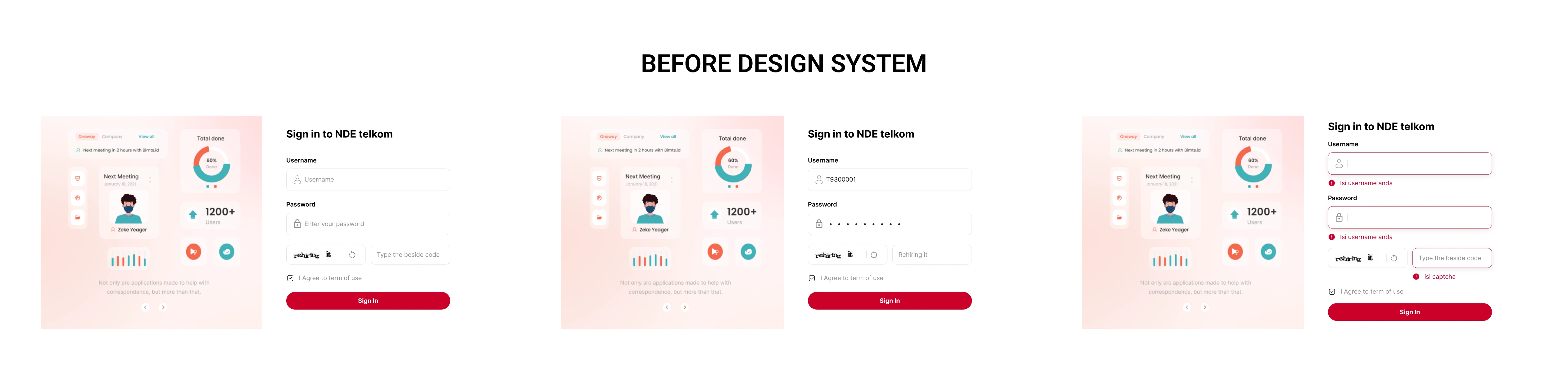
As Coofis expanded its features, UI decisions were made incrementally without a centralized design standard. Over time, this led to duplicated components, inconsistent spacing, conflicting color usage, and unpredictable interaction patterns.
Designers recreated similar components from scratch. Developers implemented variations of the same UI logic across modules.
The issue was not visual inconsistency alone.
It was system fragmentation.
This fragmentation slowed development, increased review cycles, and reduced overall product coherence.
What was actually broken
Before proposing a solution, a UI audit was conducted across key modules.
The audit revealed:
- Multiple button styles performing identical actions
- Inconsistent typography hierarchy
- Non-standardized spacing rules
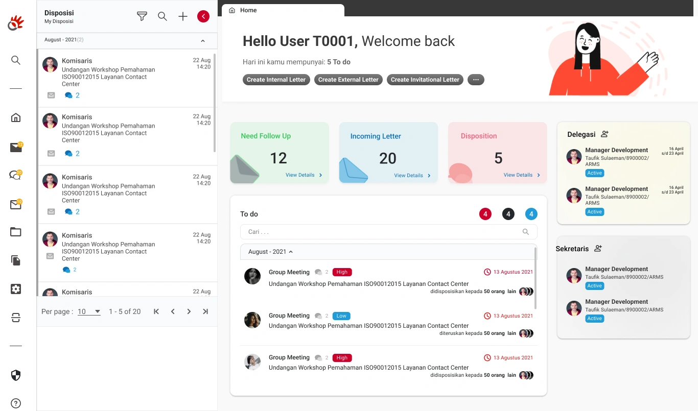
- Repeated table patterns with slight variations
This lack of standardization increased cognitive load for users and maintenance overhead for developers.
Research, building on proven foundations
The research combined literature studies (Atomic Design, Material Design, Carbon), visual audits, and interviews with designers at PT ARM Solusi.
Interviews revealed the need for standardized elements, better documentation, and clearer collaboration practices. Pre-design testing showed that simple tasks like login flows took excessive time without a unified system.
Approach
Instead of immediately designing components, the first step was defining foundational principles:
- Functional clarity over visual decoration
- Reusability over one-off design
- Scalable token structure
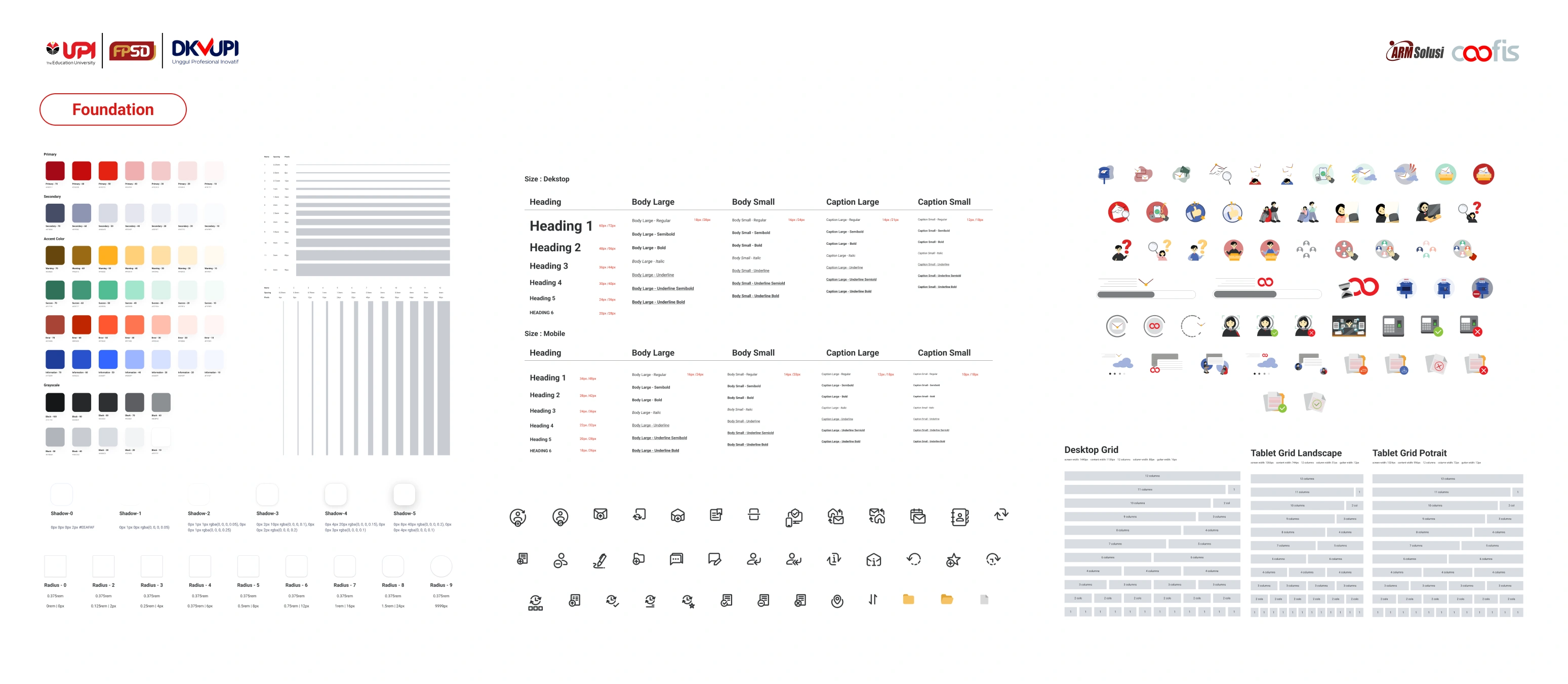
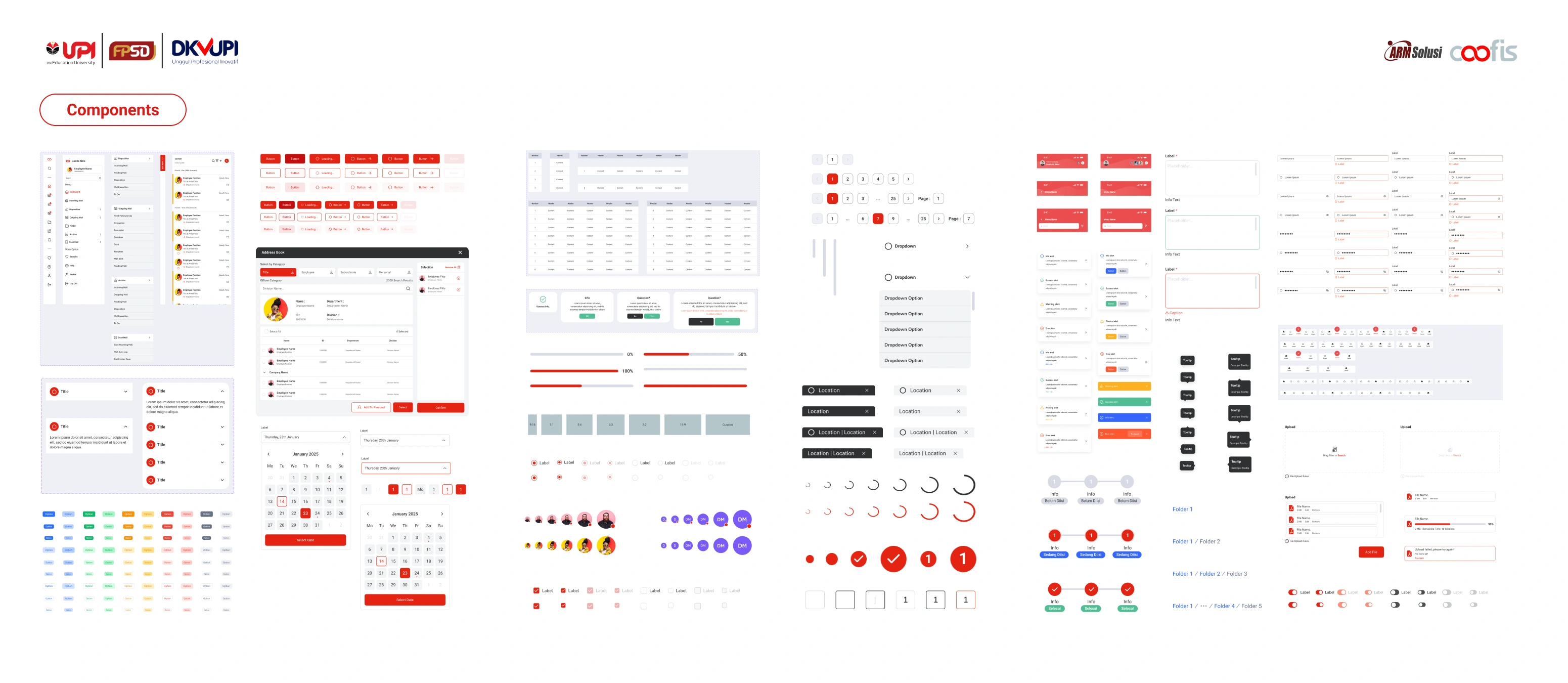
The system was structured into three layers:
- Foundations (color, typography, spacing, grid)
- Components (buttons, tables, forms, navigation)
- Patterns (dashboard layout, data presentation logic)
This ensured consistency from micro to macro level.
Building the system
Foundations
Color tokens were reduced and functionally mapped to semantic roles such as primary, success, warning, and danger. Typography scales were standardized to enforce hierarchy consistency across dashboards.
Components
Reusable components were built with defined states (default, hover, active, disabled, loading). Clear usage documentation reduced ambiguity during implementation.
Patterns
Common dashboard structures and data tables were standardized to prevent structural drift across modules.
Adoption strategy
The success of a design system depends on adoption.
To ensure integration, documentation guidelines were created and shared with developers. Component usage rules were clarified to prevent deviations during feature expansion.
Regular alignment discussions were conducted to refine the system iteratively.
This shifted the workflow from reactive redesign to proactive system governance.
Impact, efficiency & scalability
To evaluate impact, usability testing was conducted before and after implementation. Designers were asked to complete common interface tasks such as building a login flow.
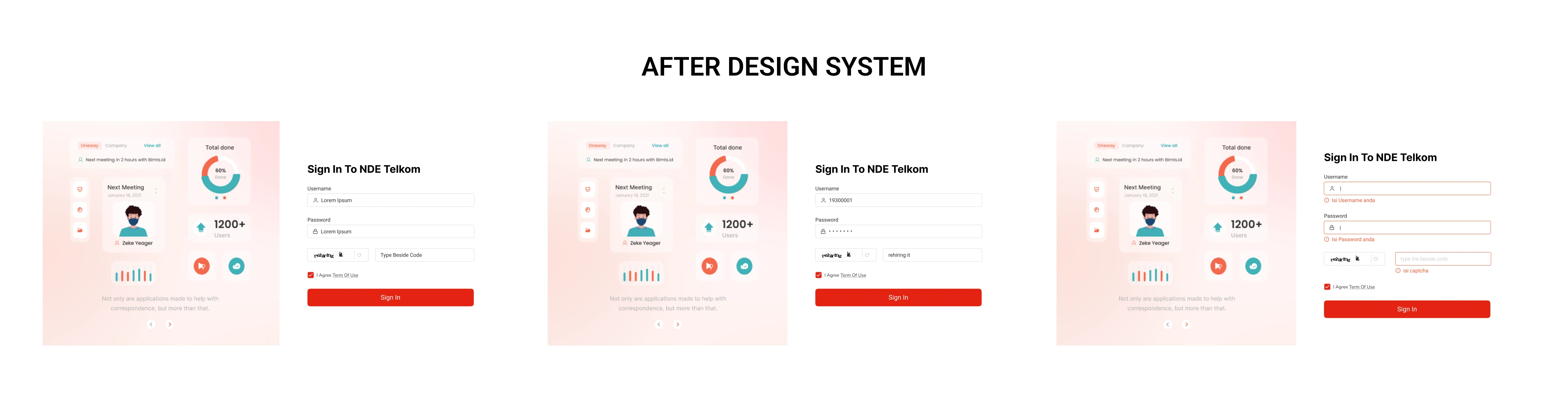
After implementation:
- UI inconsistencies were significantly reduced
- Development handoff became faster due to clearer component logic
- Feature expansion required fewer design revisions
- Cross-module visual coherence improved
The design system transformed Coofis from a growing interface into a scalable product ecosystem.
Reflection
Design systems are not static deliverables. They are living frameworks that require governance and continuous refinement.
This project strengthened my understanding that system thinking is not about designing more components, but about reducing entropy as a product grows.
Collaborator
This project was part of my final thesis and completed with guidance from academic supervisors. Insights from Muhamad Faizal, UI designer at PT ARM Solusi, provided valuable perspective on practical needs and challenges in Coofis. The Coofis Design Team supported the development of UI elements, helping ensure the system could be applied effectively.