Academic teamwork often fails not because of skill, but because of misaligned communication.
Tarea! is a task and collaboration platform designed to simplify how student teams coordinate, assign, and track work within short project cycles.
The core problem
Student teams working under tight deadlines struggled with fragmented communication. Tasks were discussed in chat, updated manually, and often lacked clear ownership.
The result was predictable:
Missed updates. Confusion. Repeated discussions.
The real issue was not productivity. It was alignment.
Research
During interviews and observation, several patterns emerged:
- Team members were unsure about task ownership.
- Deadlines were visible, but task progress was not.
- Feedback was often buried in chat conversations.
One insight stood out:
Teams don’t need more tools. They need shared visibility.
Product direction
Instead of building a full project management suite, Tarea! centered on three principles:
- Clear task ownership
- Visible progress tracking
- Lightweight communication
This meant intentionally avoiding complex features such as advanced reporting or multi‑layer hierarchies. Trade‑offs were made to preserve focus.
Iteration
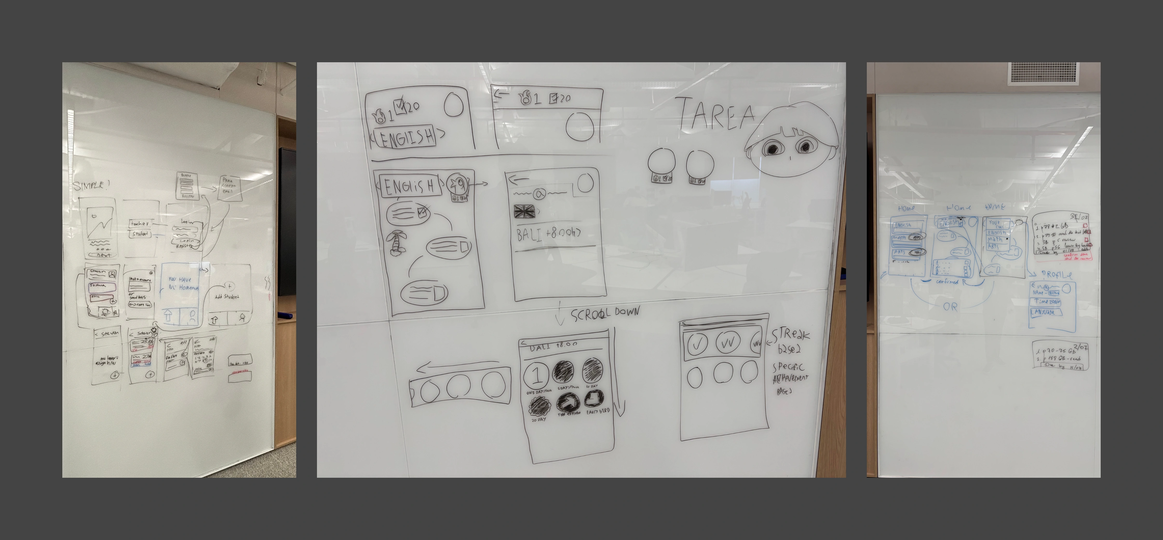
Early ideation explored Kanban‑style boards. However, testing revealed that smaller student teams found this structure too heavy for short project cycles.
The interface was simplified into list‑based task views with clear status indicators and personal assignment visibility.
By reducing structural complexity, the product became faster to navigate and easier to adopt.
The final experience
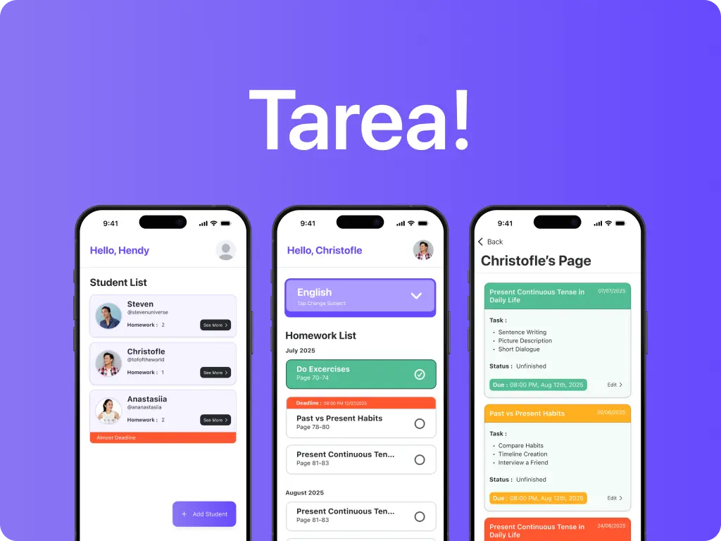
Tarea! structures teamwork into clearly defined spaces. Each user sees their assigned tasks immediately upon login. Status indicators reduce the need for repeated verbal check‑ins.
Communication is contextual, attached to tasks rather than separated in chat threads.
This design reduces friction in coordination and makes accountability visible without being confrontational.
Results & impact
During prototype testing, teams were able to identify task ownership 40% faster compared to their previous workflow.
Participants reported feeling more aware of project progress without needing to ask for updates repeatedly.
Even simple structural clarity significantly improved coordination confidence.
Early exhibition feedback praised the clean interface and practical relevance, validating our direction before public launch.
What I learned
Working within a multidisciplinary team required balancing design idealism with development feasibility. Several proposed features were removed due to timeline constraints, reinforcing the importance of prioritization.
This project strengthened my ability to design for collaboration systems, where clarity often matters more than feature depth.
This project wouldn't have been possible without the team.
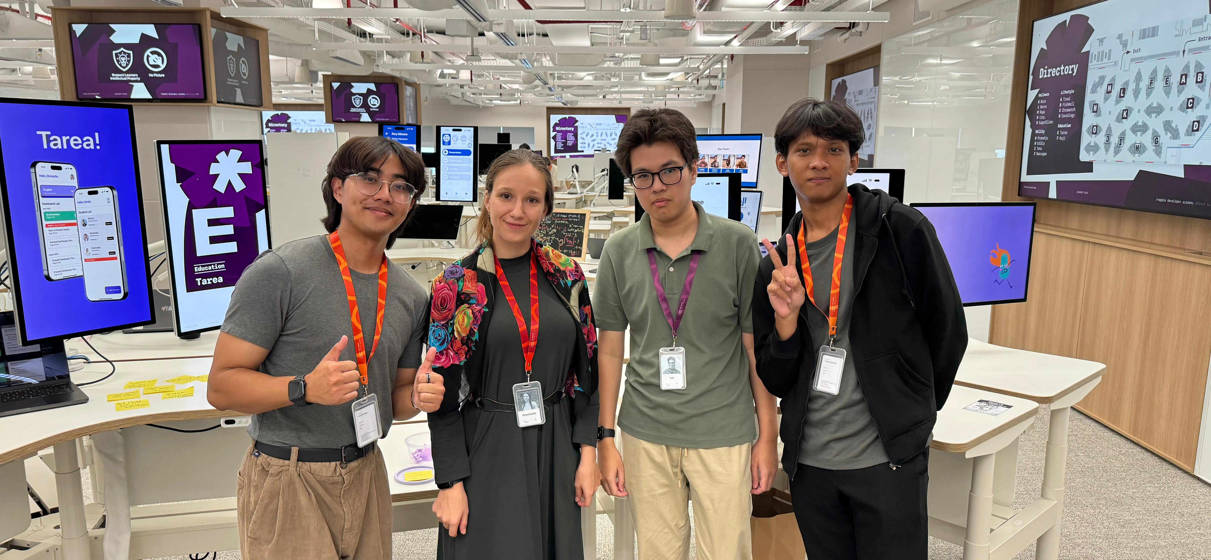
It came to life through shared ideas, collaboration, and creativity.
Designer: Hendy Oktavian
UX Research: Anastasiia Firsova
Coder: Christofle Valiant
PM: Steven (Phi Phi Pham)